

E-commerce & retail
180 e-Commerce
A mobile commerce app for branded fashion and accessories, built around four ways to trade: purchase, sell, rent and auction.
- Industry
- E-commerce & retail
- Platform
- Mobile app
- Our role
- UI/UX Design + Development
Project overview
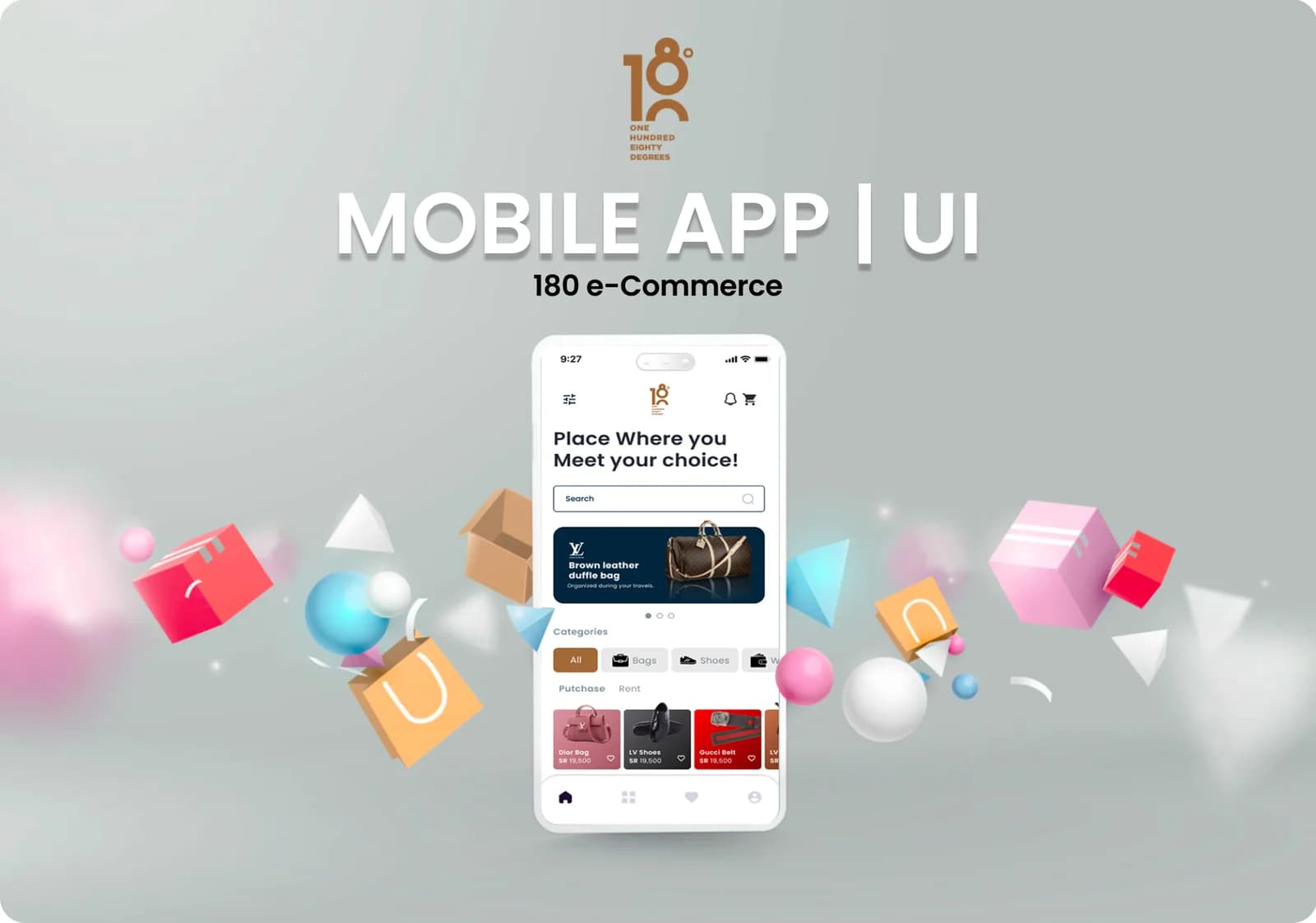
180 e-Commerce is a mobile shopping app for branded fashion and accessories. Its presentation shows a single app that supports four ways to trade (purchase, sell, rent and auction), with account creation, phone verification and a product catalogue organised by category.
What the app does
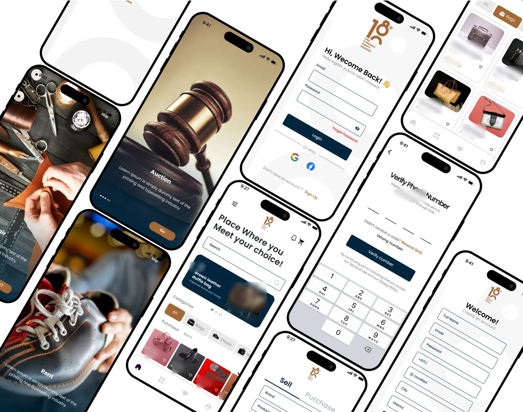
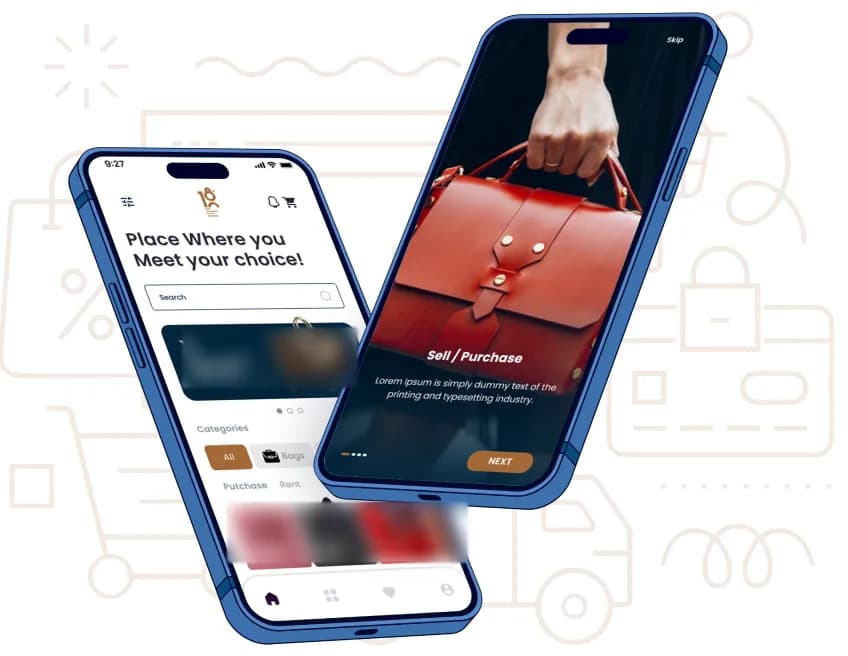
The app introduces each way to trade on full-screen onboarding cards, then takes shoppers to a home screen with search, a promotional banner, category filters and a product grid that switches between purchase and rent. Sellers list an item through a Sell / Purchase form with brand and product fields.
From the project presentation
Key screens and user flows
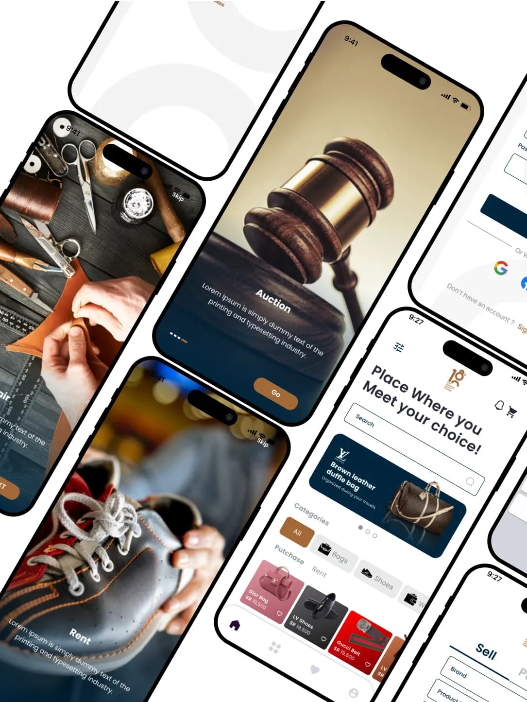
Onboarding
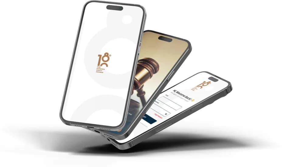
A branded splash screen leads into full-screen introductions for Sell / Purchase, Auction and Rent, each with pagination, a Skip option and a single call to action.
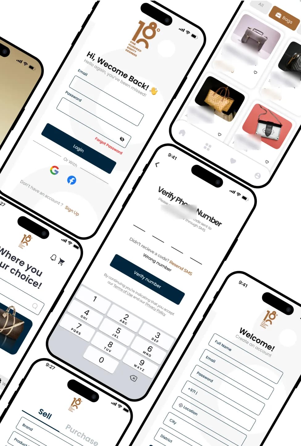
Account access
Email and password sign-in with Google and Facebook options and a forgotten-password link; sign-up asks for name, email, password, phone, location, city and district; a four-digit SMS code verifies the phone number.
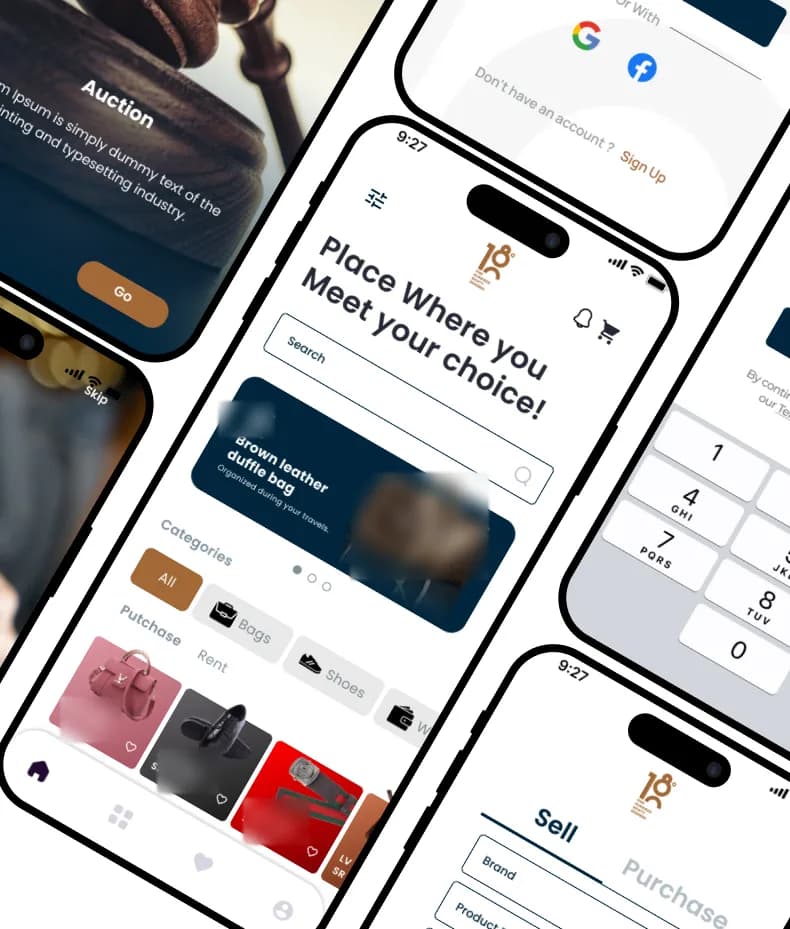
Browse, buy and sell
The home screen combines search, a promotional carousel, category chips and Purchase and Rent tabs with product cards that show price and a favourite action. The Sell / Purchase form starts a new listing.
Visible features
- Branded splash screen
- Onboarding for Sell / Purchase, Auction and Rent
- Google and Facebook sign-in
- Forgotten-password link
- SMS phone verification with resend and wrong-number options
- Sign-up with location, city and district
- Search, notifications and cart in the header
- Promotional banner carousel
- Category filters
- Purchase and Rent tabs
- Product cards with price and favourites
- Sell / Purchase listing form
- Bottom navigation: home, categories, favourites, profile
Design approach
Photography-led onboarding
Each mode is introduced with a full-bleed product photograph, a short caption and a single action, so the four ways to use the app are clear before sign-in.
A calm canvas for products
Light surfaces let product photography carry the colour, while deep navy and a warm bronze accent mark primary actions and selected states.
Consistent, familiar controls
Rounded input fields, full-width primary buttons and pill-shaped category chips repeat across sign-in, verification and browsing.
Commerce essentials within reach
Search, notifications and the cart sit in the home header; favourites and the profile are one tap away in the bottom navigation.
Design system
Colour palette
- Bronze accent
#A36937 - Deep navy
#0C283B - Light canvas
#F5F5F5
Typography
Poppins
A geometric sans-serif used throughout, from bold headlines to form labels. Shown here in this site's system typeface.
This case study is based on the original project presentation. Personal details, third-party names, prices, offers and QR codes are obscured in the images where they appeared; it makes no claims about results, launch status or the technology used.
More projects
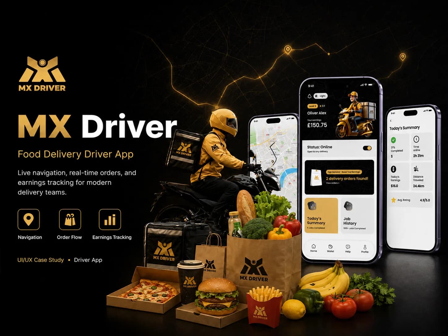 Logistics · Mobile appMX DriverA driver app for food delivery that takes couriers from sign-up to accepting orders, collecting and delivering them, and reviewing the day's work.Our roleUI/UX Design + DevelopmentView case study
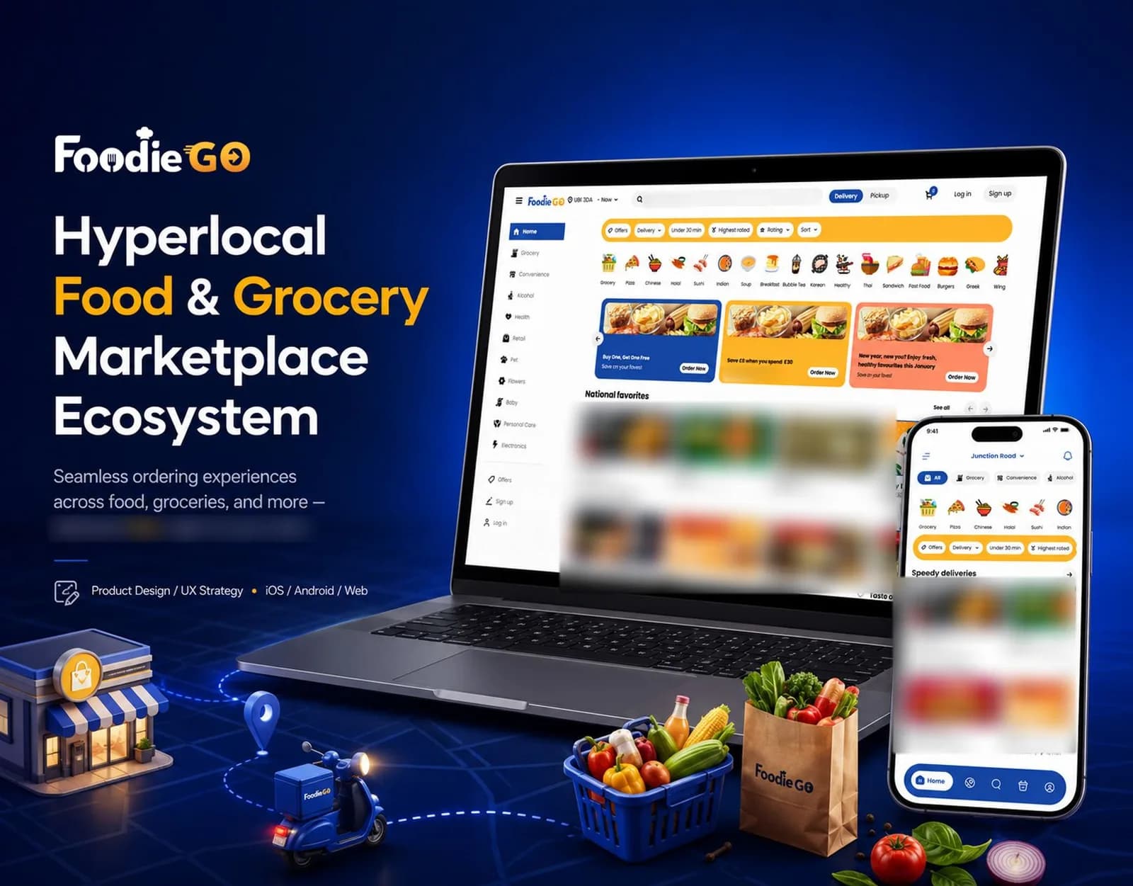 Food & Grocery · iOS, Android and webFoodieGoA hyperlocal food and grocery marketplace for iOS, Android and the web, covering category browsing, delivery or pickup ordering, order tracking and merchant tools.Our roleUI/UX Design + DevelopmentView case study
 Education · Mobile appAl BurhanA mobile app that brings class attendance, attendance history and reporting together with lecture content and illustrated guides to Makkah and Medina.Our roleUI/UX Design + DevelopmentView case study
Tell us what you want to build.
Share your goals and we will recommend where to start.