

Logistics
Insta Truck
A logistics app for customers and drivers, with vehicle booking, scheduling, booking QR codes and cargo tracking.
- Industry
- Logistics
- Platform
- Mobile app
- Our role
- UI/UX Design + Development

Project overview
Insta Truck is a logistics mobile app for customers and drivers. Its presentation follows a customer from choosing a role through booking a vehicle, receiving a booking QR code and tracking orders.
What the app does
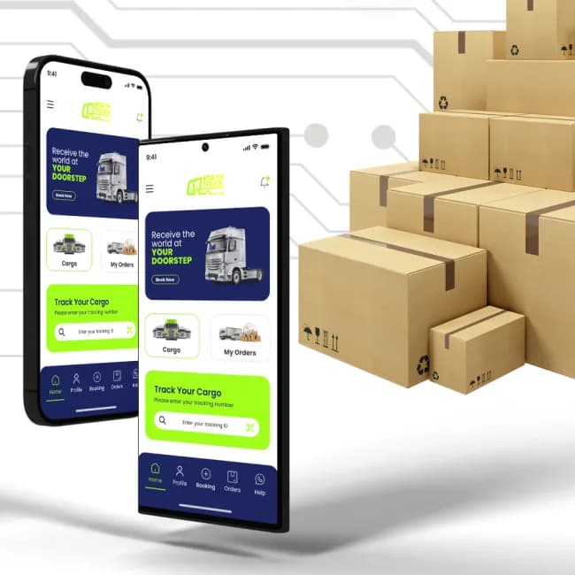
After choosing Customer or Driver, a user signs in by phone number or email. The home screen offers Cargo, My Orders and a tracking search. A single booking screen collects the vehicle, pickup and delivery locations, date, time and a description of the cargo.
From the project presentation
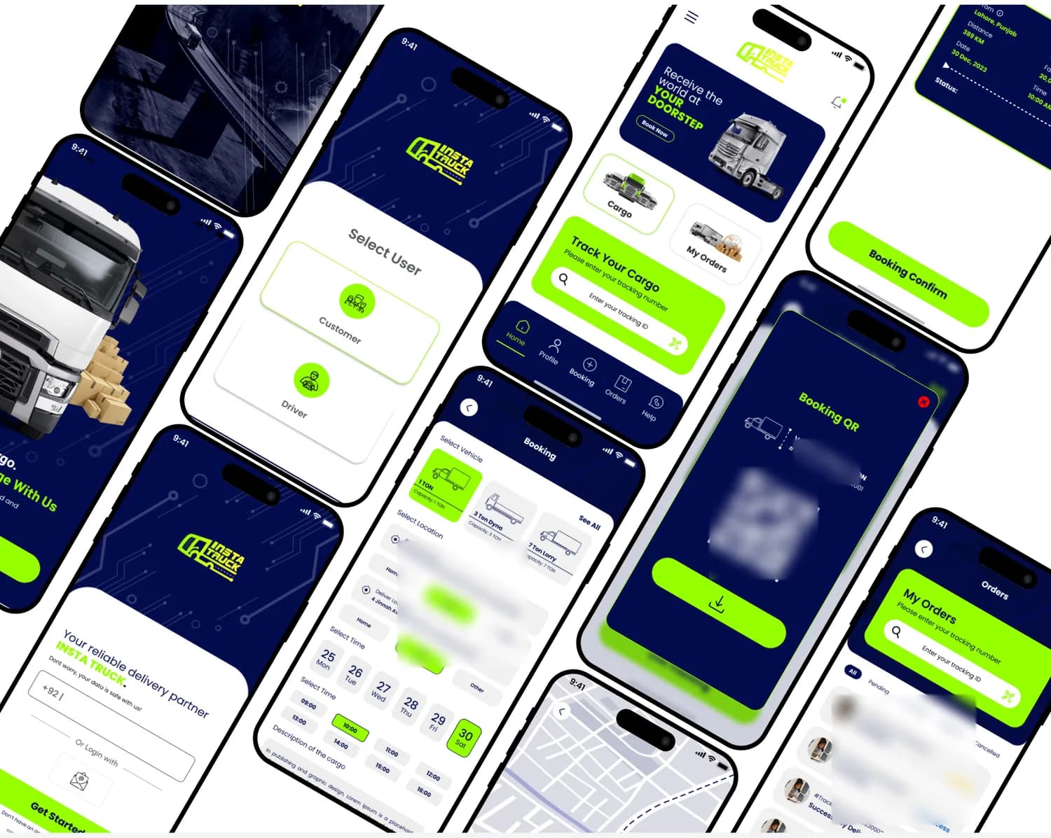
Key screens and user flows
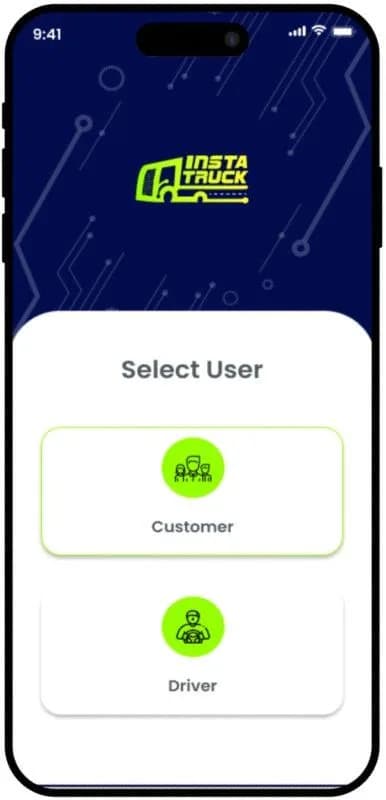
Choose a role
The first choice after the splash screen is Customer or Driver, shown as two large cards.
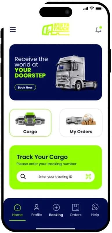
Home and tracking
A promotion with a Book Now action sits above Cargo and My Orders, with a tracking search and five-item navigation below.
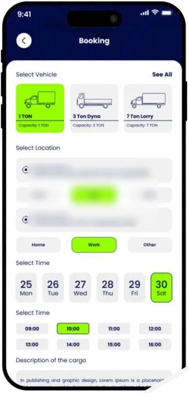
Book a vehicle
Vehicle capacity, pickup and delivery locations saved as Home or Work, date and time slots, and a cargo description sit on one screen.
Visible features
- Customer and driver roles
- Phone number and email sign-in
- Cargo and My Orders on the home screen
- Tracking number search
- Vehicle choice by capacity
- Saved Home and Work locations
- Date and time slots
- Cargo description
- Booking confirmation summary
- Booking QR code with tracking ID
- Order tabs by status
- Map view
Design approach
Tracking comes first
A large tracking search fills the middle of the home screen, directly under the main promotion, so a common task needs no navigation.
One screen to book
Vehicle, location, date and time are chosen on one scrolling screen, using tiles and chips rather than long forms.
High contrast for the road
Bright lime on deep navy marks every selected option and primary action, keeping the current choice clear.
Vehicles shown by capacity
Vehicle options pair a simple outline with a capacity label, from 1 ton to a 7-ton lorry.
Design system
Colour palette
- Lime
#96FF00 - Navy
#1E2660 - Light canvas
#F0EFEF
Typography
Poppins
Used across headings, forms and booking controls, as specified on the board. Shown here in this site's system typeface.
This case study is based on the original project presentation. Personal details, third-party names, prices, offers and QR codes are obscured in the images where they appeared; it makes no claims about results, launch status or the technology used.
More projects
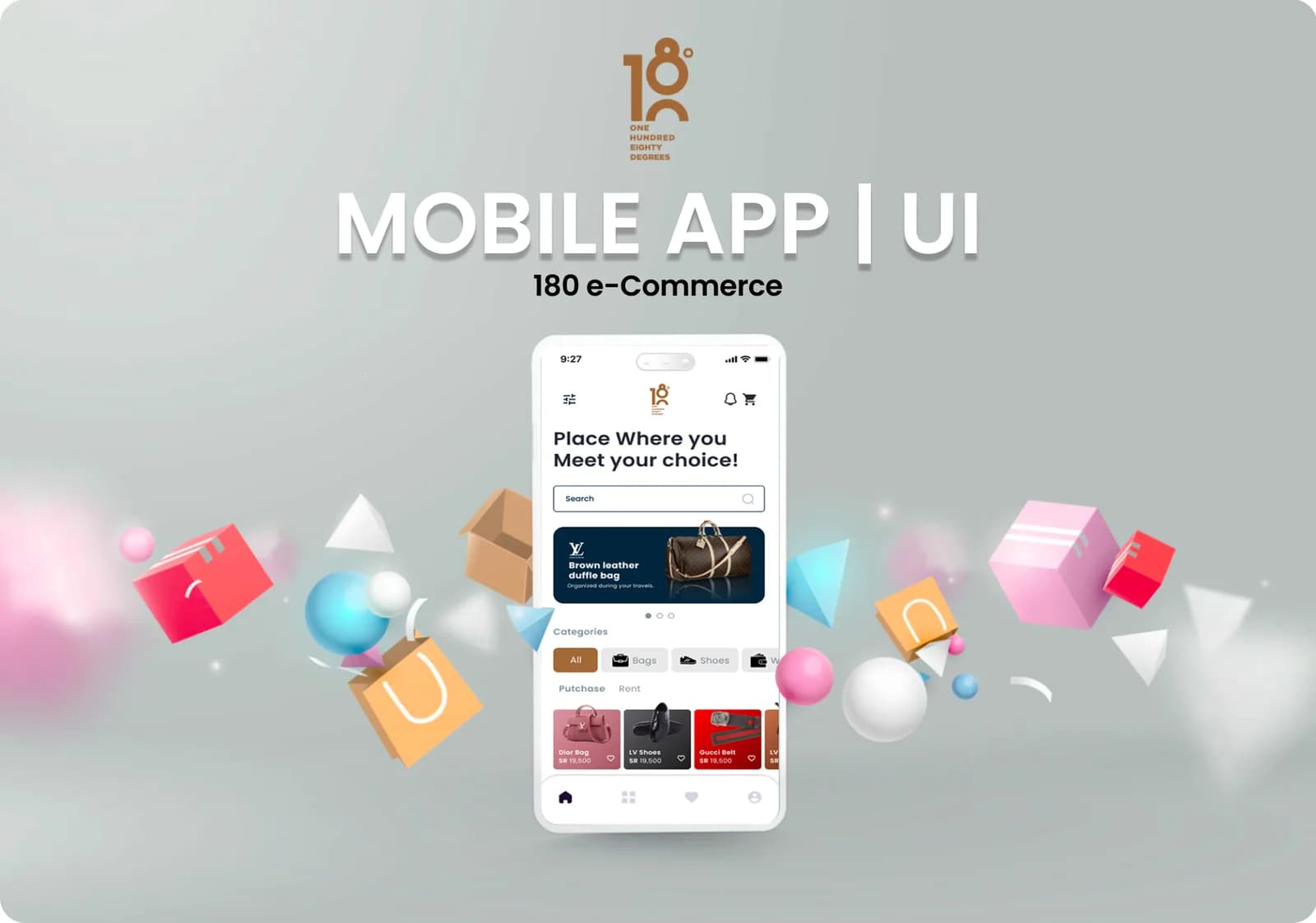 E-commerce & retail · Mobile app180 e-CommerceA mobile commerce app for branded fashion and accessories, built around four ways to trade: purchase, sell, rent and auction.Our roleUI/UX Design + DevelopmentView case study
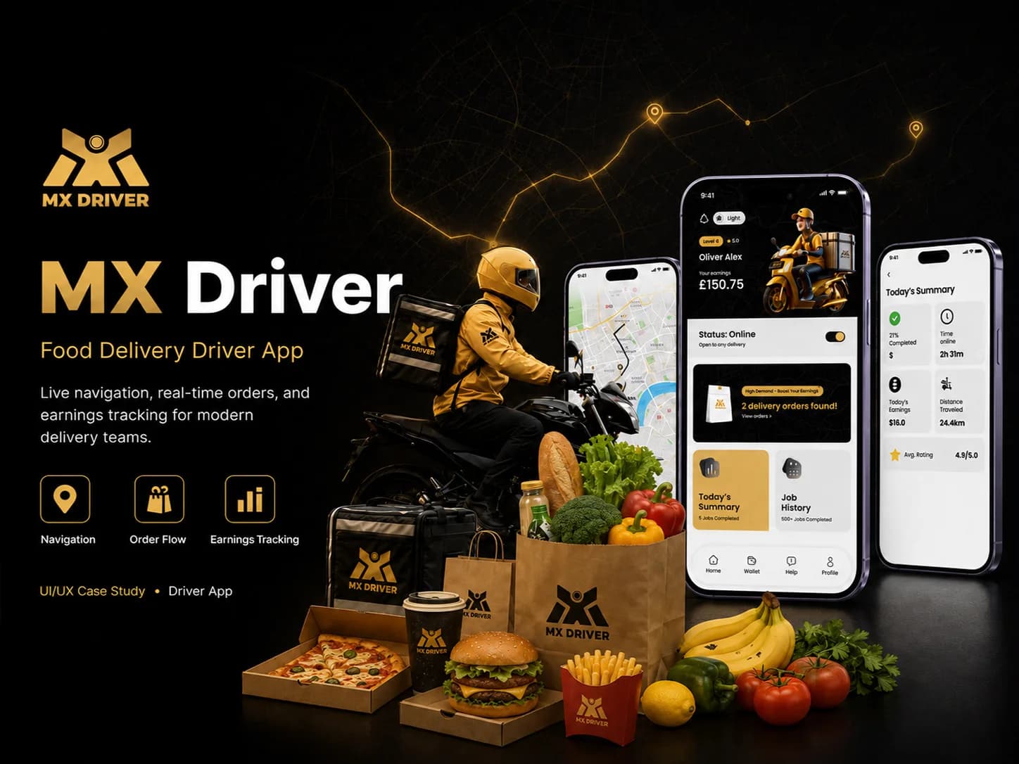 Logistics · Mobile appMX DriverA driver app for food delivery that takes couriers from sign-up to accepting orders, collecting and delivering them, and reviewing the day's work.Our roleUI/UX Design + DevelopmentView case study
 Food & Grocery · iOS, Android and webFoodieGoA hyperlocal food and grocery marketplace for iOS, Android and the web, covering category browsing, delivery or pickup ordering, order tracking and merchant tools.Our roleUI/UX Design + DevelopmentView case study
Tell us what you want to build.
Share your goals and we will recommend where to start.